


When starting an online shop, it's tempting to invest heavily in branding and website design from the beginning. People often want their brand to be perfect from the start, and they think that investing a lot of money is necessary for success.
However, overspending on a logo and design may not be the best approach, especially for small online shops that have limited budgets. This article will provide tips on how to design your own branding and website with no budget, enabling you to create quality designs and achieve success without having to pay a professional.
Why you shouldn't invest heavily into branding when starting out
When starting a small online shop, you might be tempted to invest heavily in branding and website design, thinking that it is necessary for success. However, there are several reasons why overspending on branding may not be the best approach, especially at the initial stages.
First, your branding is a reflection of who you are, the audience you serve, and your core values. At the beginning, your audience is not yet defined, and who you think they are might even be different from who they really are. Therefore, spending a lot of time and money on a logo at the beginning, only to change it a few months later, would be a waste.
Remember, people don't buy your product because of your logo. While a well-designed logo can help make a good impression, people might often only pay attention when there's something wrong with it. For example, if it's hard to read or not relevant to the brand, it might turn potential customers away.
Many would agree that stylized text-based logo would often be more than enough to get you going. Namelix and Canva are some great places to start when designing a logo without spending money. These tools offer various design options that allow you to create a simple and effective logo that reflects your brand's personality and values.

Finally, once you become more established and understand a lot more about your customers and your positioning, it would make a lot more sense to invest properly in a re-branding effort. By then, you will have a better idea of what your customers respond to, what sets you apart from your competitors, and what kind of brand identity you want to portray.
While branding and website design are important for small online shops, investing heavily in these areas from the beginning might not be the best approach. It's important to understand your audience, core values, and positioning before investing in branding. A simple, effective logo can often be enough to get you started, and you can always invest more once you become more established.
Branding: Pick your color palette first
Your brand's color palette should reflect its personality and values and evoke the right emotions and associations in customers. Before designing your logo, choose your color palette first. Use online tools like Coolors, Paletton, or Color Hunt to create a cohesive color scheme and browse other brands for inspiration.
Consider your brand's personality and the emotions you want to evoke. For example, choose earthy tones and natural colors for eco-friendliness, or bright, bold colors for energy and excitement. Also, consider the psychology of color and choose colors that align with your brand's message.
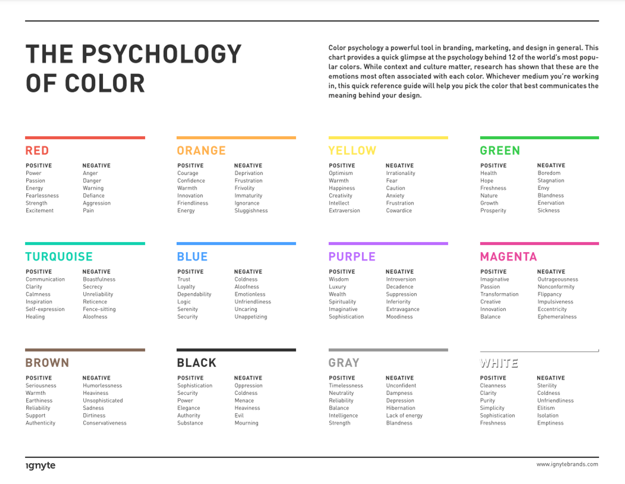
Consistency in color will make your brand more memorable to customers. Use the same colors in your logo, website design, marketing materials, and social media graphics.
To summarize, choose a color palette that reflects your brand's personality and values, evokes the right emotions, and aligns with your message. Use online tools and consider the psychology of color when choosing your palette, and use the same colors consistently throughout your brand package.
How we picked our colors
I started with finding a color palette using coolors.co (their Instagram account @coolors.co is also very helpful in helping you get started with hundreds of color palette inspirations).
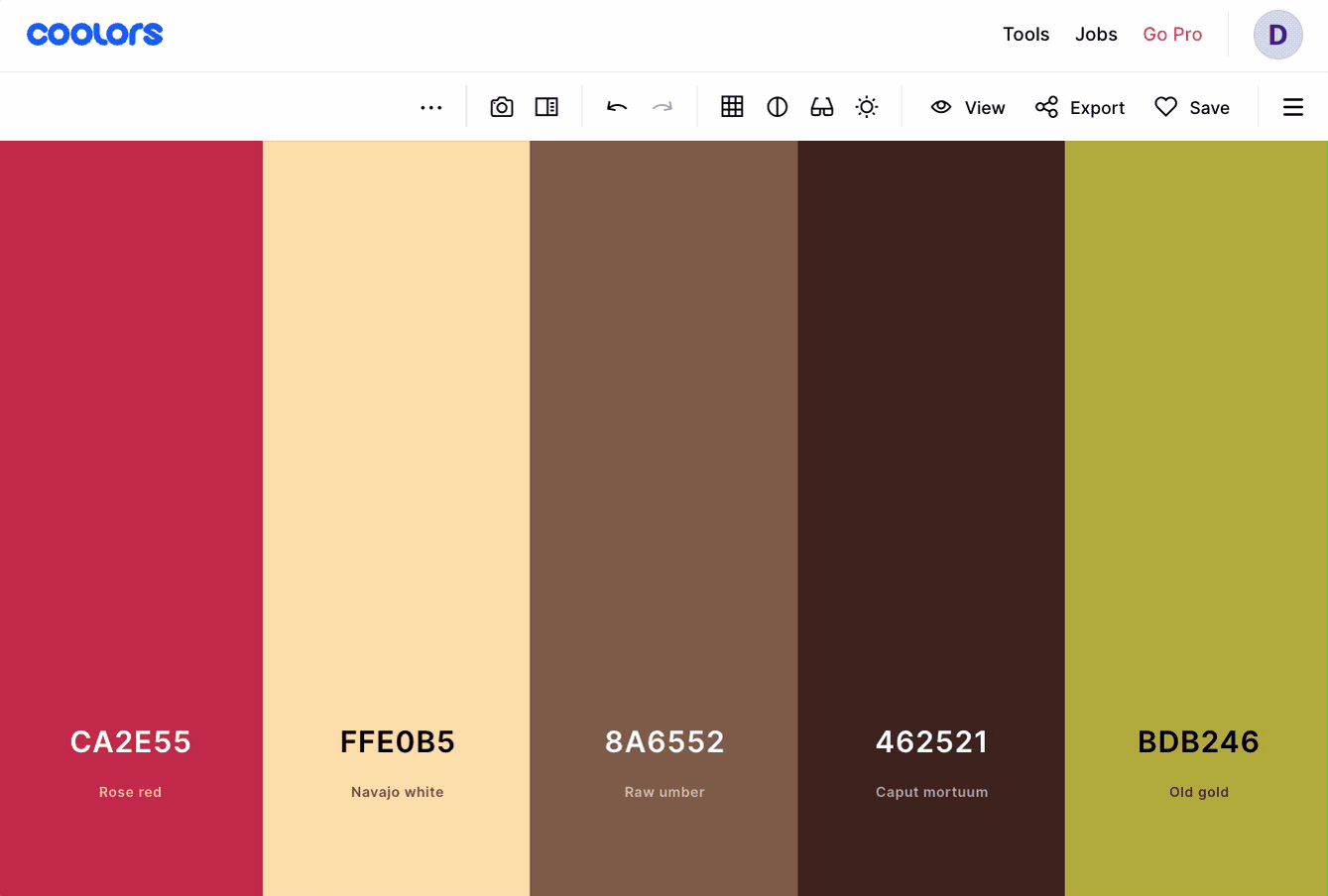
If you are still stuck, find a few photos/images/screenshots of sites you like and drop them into the Image Picker page to see which colors they use.

Choosing a logo style
For Impack, I went with Canva, every small business’ go-to option for anything design-related. I tried not to do anything too elaborate: Just stylized texts and sticking to the color palette above.
![]()
Canva’s large library of logo, combined with your chosen brand name and color palette should allow you to create a fairly unique logo to get started!
Working on your website
Since my experience is limited to Shopify, I can only share about the options available on Shopify. However, from my conversations with other shop owners, most of these will also be applicable on other platforms.
Why Shopify is great for designing your ecom store
One of the benefits of using Shopify is its fairly rigid design framework. When setting up your site, you enter the main colors and the fonts you want to use, and Shopify will then set up a basic frame for your site. While you can add and rearrange blocks, you can't move elements around freely like you can with other platforms such as WooCommerce, Weebly, or Wix.
This may seem limiting at first, but it's actually a good thing for e-commerce sites. Most Shopify themes, including the free ones, have been optimized for e-commerce, meaning your site's design will be optimized for selling products. Changing the design too much could make it harder for visitors to navigate your site.
Choosing a theme
Since Shop 2.0 was released last year, the free themes have been upgraded with a ton of great features. In fact, we’re still using the Dawn theme which is completely free for Impack! In my opinion, it is one of the most flexible free themes out there, and you can do a lot of customizations to it.
If you want to venture into paid themes, Out Of The Sandbox has some of the best themes, hands down, and many of the big brands are using them. They have a ton of customizable options and are all built with one specific goal: Conversion. We are using their Flex theme over at nightingale.baby and personally, I cannot recommend them enough.
If you want to invest in a great theme but are in no rush to grab it, wait for their Black Friday campaign as they usually have a 20-25% discount then. If you cannot wait, try the code 4814 as it should give you 10-15% off (depending on when they have extra promotion). Full disclosure: that’s my affiliate code so I get a commission if you end up purchasing.
Readability
Testing for readability is probably one of the most overlooked tasks when designing a website. When designing a website for your small online shop, it's essential to ensure that your content is readable and easy to understand. Readability refers to how easy it is to read and understand the text on a page. Factors affecting readability include font size, style, line spacing, and contrast between the text and background.
Text Readability
To test for text readability, you can use online tools such as Readable, Hemingway, or Grammarly. These tools can analyze your text and provide feedback on factors such as sentence structure, word choice, and overall readability. You can also test your website on different devices and screen sizes to ensure that your content is readable and easy to understand for all users.

Color Readability
Color readability is also an important factor to consider when designing your website. The contrast between the background color and the text color can affect how easy it is to read your content. Low-contrast color combinations or colors that clash can cause eye strain and make it difficult for users to read your text.
To ensure that your website has good color readability, use Colorable or Userway to check how they look against each other.

Userway contrast checker can also let you know if your texts are WCAG-compliant
Additionally, use a font size and type that are easy to read, and consider using shorter paragraphs and sentences to make your content more scannable. The rule of thumb we use in our team is to never have more than 3 sentences in a paragraph.
A final check for readability is to test your website on multiple devices, namely mobile and desktop. As of November 2022, smartphone visits make up 49.78 percent of all online traffic, according to Oberlo. That’s why ensuring that your website is mobile-responsive and your content is easy to read on smaller screens is super important.
Best Practices for Product Photos and Videos
Product photos and videos are essential for any e-commerce site, as they allow customers to see what they're buying and can influence purchasing decisions. Here are some best practices for taking and using product photos and videos on your small shop's website:
- Use high-quality photos: They don’t always have to be professionally taken if that’s not within your budget, but your product photos should be high-resolution and clear. Customers will not purchase products that they cannot clearly see, and blurry or pixelated photos can give the impression of low quality.
- Use consistent lighting and background: Consistent lighting and background can make your product photos look more professional and cohesive. Try to use natural lighting or a lighting kit, and use a plain, neutral-colored background.
- Show different angles: Customers want to see different angles of the products they're considering purchasing. Consider showing front, back, side, and detail shots.
- Use lifestyle photos: Lifestyle photos show your products in use and can help customers imagine themselves using your products. For example, if you sell clothing, show your clothes being worn by models or in a natural setting.
- Include a product video: A product video can be taken using just your phone, but it goes a long way in helping buyers see what the products look like in action or up close, in ways that photos can't offer. For example, if you sell kitchenware, show how your product is used to cook a meal. For clothing, film yourself or ask a friend to model and try on the item.
- Optimize your photos and videos for web: Large file sizes can slow down your website's load time, so optimize your photos and videos for the web by compressing them or using a tool like TinyPNG.
Learn more about Custom Packaging & Stickers
Putting it All Together: Creating a Winning Online Brand for Your Small Shop
In this article, we've discussed several important factors to consider when creating a winning online brand for your small shop. Here's a summary of what we've covered:
- When starting out, it's important not to overspend on branding. Instead, focus on creating a solid foundation that can be built upon as your business grows.
- When choosing your color palette, consider your brand's values, audience, and emotions you want to evoke.
- When designing your logo, consider a text-based design and use online tools to generate ideas and inspiration.
- When designing your website, consider using Shopify for its optimized e-commerce design framework and carefully selecting a theme that fits your brand's aesthetic.
- Test for readability on your website to ensure that your content is easy to understand and use tools to optimize color contrast.
- Follow best practices for product photos and videos, including using high-quality images, consistent lighting, and including a product video.
By following these guidelines, you can create a cohesive and professional online brand that reflects your small shop's values and attracts customers. Remember to take your time, experiment, and adapt as your business grows and evolves. Good luck!


